
37.7749° N · 122.4194° W
GIS Analyst focused on spatial analysis, remote sensing, and decision-ready geospatial systems.
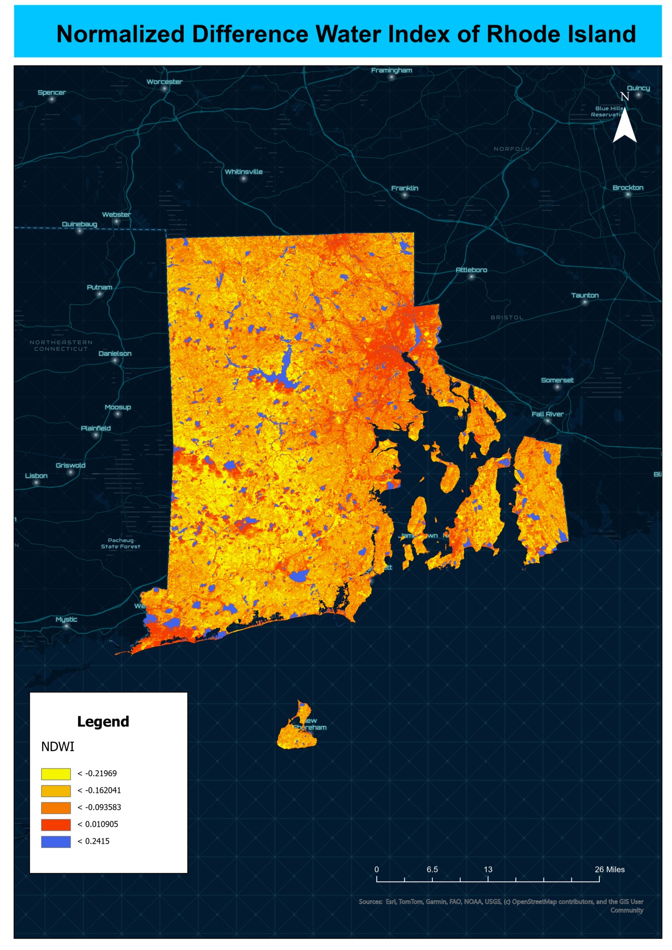
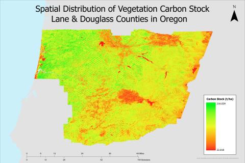
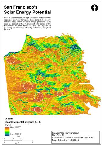
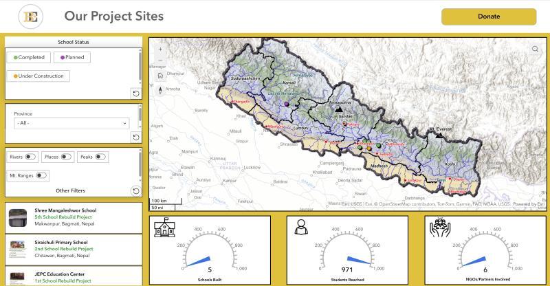
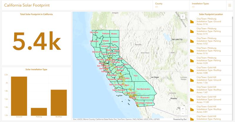
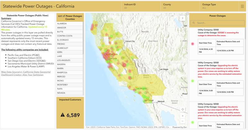
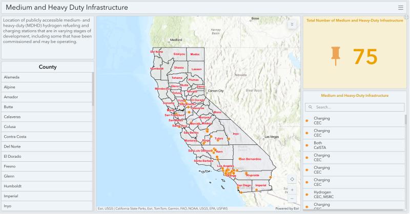
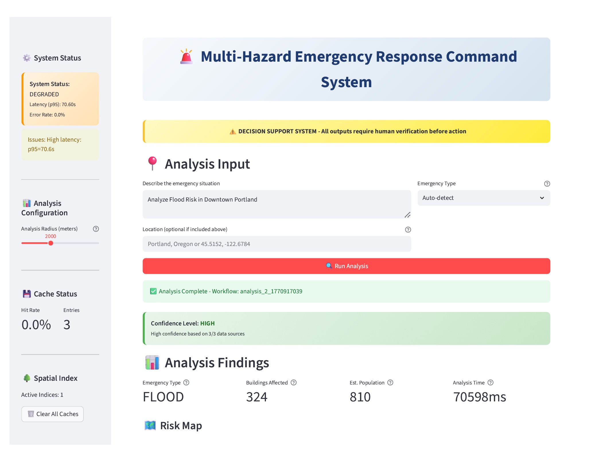
I design and deliver GIS decision-support systems — using ArcGIS Pro, SQL, PostgreSQL/PostGIS, remote sensing, and web GIS — that help organizations evaluate risk, plan infrastructure, and understand complex geographic systems. Work supports infrastructure planning, transportation analysis, environmental risk assessment, and operational decision-making — built on structured spatial data, rigorous validation, and clear outputs.
40+
Mapping products delivered
7
Domains & industries
100+
Civil servants trained
 Project-1.png)
 Project-2.png)